
Jake Threads and Shut Up and Take My Money Website Analysis
Websites today have an incredible impact on our lives. We come into contact with websites that want to empower us, supply us with something, and inform us. Personal style and expression have never been more present than today with endless amounts of websites. Since the time you've read up to this sentence, websites have been published. Jack Threads, a men's retail site, and Shut Up and Take My Money, another retail site, are both created as spaces on the internet to allow unique expression from art, to shirts, to watches, to Star Wars merchandise, to the coolest of inventions. These websites are dedicated to being your own person.
Jack Threads
This retail website called Jack Threads has created a space for men to modernize a classy adult style. The
purpose of Jack Threads is to create a space for men with a modern sense of
style for clothes, accessories and art.
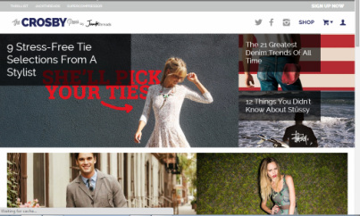
This website is more about allowing an expressive opportunity for men rather than a social issue. There is a style that is being presented on this website that is rarely found in one place, and that was Jack Threads' goal. Jack Threads' logo alone expresses that combination of style and class. The "Jack" is written in a hand written style. Just like our individuality, our hand writing is personalized to ourselves. Just ask any teacher about recognizing her own students' handwriting. The "threads" is written in a formal computer generated font. This is the structure and class that Jack Threads is still about. This logo is still on the page, no matter what sub-pages you click on. If you removed the pictures that link to all the products and product list, you'll see that the website has no real detail. This is done because Jack Threads wants to focus all of your attention on the products. This is also a great marketing strategy; additionally, their purpose is to supply more tools to express individual personality so focusing on the products makes a ton of sense. Jack Threads does an interesting job addressing their audience indirectly. They do so by displaying trending products on the front page of the site. This is Jack Threads saying, "We know men are looking for things like this and here they are." Jack Threads never has long blocks of text or extended paragraphs about themselves on the main page. Instead they created an online magazine called, "The Crosby" dedicated to assisting with styling yourself and other articles about trending styles; however, even here the paragraphs continuously are broken up by pictures of styles. Some great features the website has are "The Crosby" and direct links to their social media sites. This "today's age tool" allows Jack Threads to put their site directly where pokes, likes, tweets, chats, shares, and double taps are taking place; additionally, since this website does not have a comment section under their products, this would allow their viewers that chance to give their comments. I personally really like this website because their modern art really speaks to my style. I rarely get to find a place where my sense of art is all in one place. They have great suits and blazers, jackets and boots. Its a lot of fun to explore how you would personalize your wardrobe or your home or office. While I personally don't love or even like all of their products, I love Jack Threads' goal to create a space to personalize myself the way I always wanted to. I can put up a silhouette of New York or style myself with a blazer and jeans. It will all work because it'll be me. 
|
Shut Up and Take My Money
This is a retail website called Shut Up and Take My Money. The website is dedicated to sharing amazing, nifty, and sometimes just silly products that we see on social media like Instagram. Shut Up and Take My Money goes a step further and actually locates and prices where these products are being sold, so that we may go ahead and purchase them.
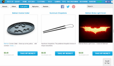
This website is really interesting where they don't have an original product, or even a product of their own, but rather offer a service to consumers. They abolish the need to search on Google for anything we see on social medias. Shut Up and Take My Money's logo is an allusion to a show on Comedy Central called Futurama. On this animated show, the character named Fry yells "Shut Up and Take My Money!" after being shown a new product. The use of this popular icon is just furthering Shut Up and Take My Money's point of sharing popular ideas with consumers. There is not a lot of website design for the simple fact that they want to draw the viewers attention to the products. There is no need for graphic designs when the site's whole point is about the products that are out there. They have a very simple blue toolbar with white lettering and white background. The page is then set up with three neatly organized columns filled with products. Shut Up and Take My Money addresses their audience with the toolbar categories. It reads "Best Of", and then has their pages written along the bar, like "Geeky" and "Tech". The main source of text on this page comes from the captions on each image. The captions are full of excitement and full of puns. Some of these products get really silly such that the captions are just further jokes. All these captions do is just further amp up the viewer on the product. Shut Up and Take My Money has direct links to their social media pages. Most websites today will have this feature because of how effective it is to reach millions of people at a time. I personally love gadgets, novelty items, knick-knacks, and just really cool inventions. I watch Shark Tank on ABC just to see the new products people are coming up with. With Shut Up and Take My Money, I get to go to one website and see hundreds of products that are just really cool to me. Some of the products aren't for me, but may still make me laugh. I can get a face hugging plush toy from the movie Alien. I could get a soap dispensing nose, or I could get a drive-able Mario Kart. If there is any website where I have seen something that I like, it's usually here for me. That is really cool. 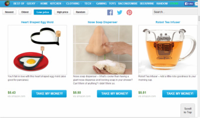
|
These two websites are incredible for restyling your life. They both use social media to reach larger audiences that would love to explore their pages. They also keep their web design very simple. Jack Threads uses a more free template on the homepage. Shut Up and Take My Money sticks with three columns of products for the entire website. This neat organization of the products is a great way to drive focus to the products.
Jack Threads
<http://www.jackthreads.com/>
Shut Up and Take My Money
<http://shutupandtakemymoney.com/>
<http://www.jackthreads.com/>
Shut Up and Take My Money
<http://shutupandtakemymoney.com/>
